
Every April, just before the television cameras arrive, the grounds crew at Augusta National in Georgia puts the final touches on the perfectly manicured yellow pansies near the entrance of the famous golf club. To sports fans, the shape of the flower bed is immediately identifiable as the logo of both Augusta and its signature event, the Masters, one of the four major golf tournaments of the year. It’s also a crude, misshapen map of the United States. As one Twitter user wrote, “If a kid drew a map that looked like the Masters logo, they would get an F in Geography.”

In a hidebound and genteel sport, Augusta nonetheless stands out. There is a strict dress code for fans in attendance, who are never referred to as fans but rather “patrons.” Brand names and advertisements are not welcome on the premises, including on the menu, where you won’t find Budweiser or Pepsi but rather “domestic beer” or a “cola.” Even the prices—$1.50 for a pimento cheese sandwich—are stuck in the last century.
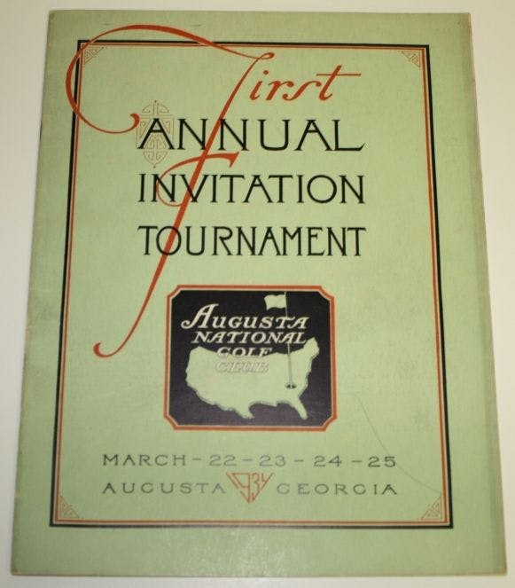
And so is the logo. Augusta spokesman Steve Ethun says there is no documented history of the logo’s origins. But it seems to date at least as far back as a 1934 poster advertising the First Annual Invitation Tournament at Augusta National Golf Club. That event was the brainchild of Bobby Jones, the legendary golfer and Georgia native who founded Augusta National in 1933. To this day, the course is considered to be the crown jewel of the PGA tour.
The logo in the poster is unmistakably a rendering of the continental United States. But the proportions are way off. The coasts are squeezed closer together, the eastern shoreline loses its westward slope, and the Great Lakes are filled in.

Today’s version of the logo is only slightly different. The northern border was bowed in 1934, similar to the Lambert projection commonly used in modern maps. Today’s logo features a straight border similar to the one found in a Mercator projection map. In 1934, Florida retained its slight angle, but on today’s Masters flag, Florida just sort of limply hangs straight down off Georgia. Even odder, Augusta National has proven itself capable of more accurate representations of the U.S. map: on the buttons of the famous green jacket awarded every year to the Masters winner.
So we can only speculate how the club and tourney logo came into existence. Printing technology was very different in the 1930s than it is today; sharp, crisp angles and precise design embellishes were harder to reproduce. A slightly abstracted version of a U.S. map might have been simpler and cheaper to recreate, particularly at a smaller size. The design could have also just been simply that: a designer’s hand-drawn, artistic interpretation of a U.S. map.
As for why the logo has remained largely unchanged through the decades, the answer is simple: tradition (unlike any other). Augusta didn’t allow its first black member until 1991, and only began admitting women in 2012, after years of public pressure, when it extended an invitation to former Secretary of State Condoleezza Rice. So don’t expect the club to change its logo anytime soon, cartographers’ outrage notwithstanding.