When you start mapping the most significant new buildings for America’s cultural institutions completed over the last 15 years—Rem Koolhaas’s crystalline Seattle Central Library, Frank Gehry’s titanic Disney Hall in Los Angeles, Tadao Ando’s serene expansion of the Clark Art Institute in the Berkshires, Herzog & de Meuron’s lush de Young Museum in San Francisco—one city barely figures on the map. New York became a new city under the laissez-faire management of departed CEO Mike Bloomberg, and supertall towers now glut 57th Street and cast their money-laundering shadows on Central Park, but most cultural buildings that arose in the Bloomberg years have little to recommend them to architectural aficionados, or anyone not in the boardroom. Only the newly verdant Lincoln Center, sensitively renovated by Diller Scofidio + Renfro, can be considered a major success. Elsewhere, the Museum of Modern Art and the New Museum opened inhospitable new spaces, and the Brooklyn Museum and Queens Museum splurged on renovations from which they gained little.
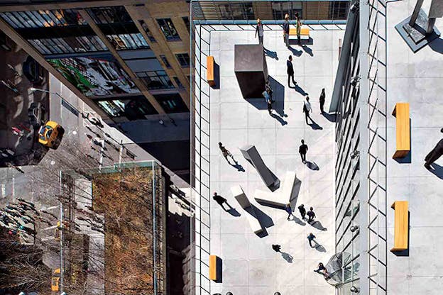
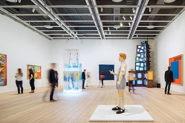
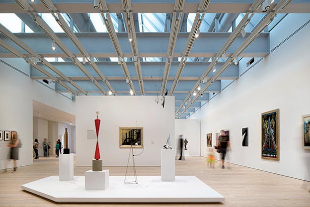
Hence the low expectations before the opening of the new home of the Whitney Museum of American Art, designed by the Genoa-born, Paris-based architect Renzo Piano, at the foot of the High Line and beside the Hudson River. Hence, too, the joy bordering on giddiness with which it has been greeted. “Unlike anything I’d experienced in over four decades in the New York art world,” wrote The New York Times’ co-chief art critic Roberta Smith. Its four main gallery spaces, the largest stretching almost the width of a city block, offer momentous backdrops without subordinating art to spectacle. Its theater, with a Hudson view, offers substantial new opportunities for a museum with the best performance curator in town (that would be young Jay Sanders, who co-organized the 2012 Whitney Biennial). The interconnected terraces, most looking onto the city rather than the river, work as legitimate exhibition spaces rather than tourist fodder. Its cracker of an inaugural exhibition—“America Is Hard to See,” a more than 600-object permanent collection showcase, organized by the gifted Donna De Salvo and three other curators—would never have been possible in its previous home, Marcel Breuer’s inverted ziggurat on Madison Avenue, which had only half the gallery space. It is civic, astute, winningly modest in both materials and form, and already homey: The leather couches on both sides of the main floor are waiting for you.
It is glorious, the new Whitney: surprise! And the surprise with which it has triumphed is not down only to other institutions’ failures. During construction, New Yorkers were stumped by the new Whitney's squat, asymmetrical exterior, variously analogized to a hospital, a waste treatment plant, an icebreaker, or, in one critic’s overheated estimation, a “nuclear-powered guided-missile cruiser.” The north façade in particular is dull, and maybe the white baffles and glass panes are a bit too Steve Jobs, yet the building has turned out to be far more legible upon completion. A central concrete spine, containing elevators and service elements, divides the office spaces on the north side from the galleries on the south. Entering from the south on Gansevoort Street, you ascend via one of three public elevators—each covered with zippy, cartoonish murals by the late Richard Artschwager—to the eighth floor, the highest of four consecutive gallery spaces.
You can proceed downstairs via elevator or internal stairwell, or else, cunningly, you can head onto the eighth-floor terrace and hop on a three-flight metal staircase, reminiscent of tenement fire escapes. What appears as clutter from the street resolves into serene, open-hearted functionalism, and the vernacular materials Piano has employed—unvarnished reclaimed pine on the floors, unadorned metal bars and tensile cables on the balconies—compound the gemütlich, welcoming atmosphere. As for the offices and conservation studio on the north side, they get ravishing views and lots of light, though also an eyeful from the exhibitionist guests of the neighboring Standard Hotel.
When the board of the Whitney finally decided it needed a new home after decades of failed attempts to expand the Breuer building, they consulted a handful of architects and asked them to name their favorite museum. Every one of them, according to Peter Schjeldahl of The New Yorker, picked the same building: the Menil Collection in Houston, Piano’s low-slung pavilion whose ceiling of wave-shaped louvers transmutes the Texan sun into cool, even light. Even if the Whitney surveyed a bunch of Piano-philes, they did not lack other options. Piano has masterminded more than two dozen art museums, usually incorporating light-modulating roofs, expanses of glass, blond wood, and high prices. In an age when museums have overtaken churches as the apex of architectural aspiration, Piano is our Brunelleschi. Yet he has a strangely unsteady hand when it comes to museum commissions, and it was not clear until this spring which way the Whitney would fall.
In the past year, partially with the Whitney’s construction on my mind and partially just as way-stations on the ceaseless forced march of the contemporary art circuit, I’ve visited half a dozen of Piano’s museums, in Boston, Los Angeles, Paris, Oslo, Basel, and New York. My journey did not include his most beloved museum (the Menil), or his most daring one (the Centre Culturel Jean-Marie Tjibaou in Noumea, New Caledonia—somehow no one has yet set up a Polynesian biennial). But my Piano grand tour took in museums large and small, early and new, and revealed just what ingredients go into a successful new institution or renovation, how easy it is for grace to sour into homogeneity, and how shrewd, or lucky, the Whitney’s team has been.


Piano, after all, is responsible for the museum that most transformed the standing of museum architecture in the hierarchy of building and of urban design: the Centre Georges Pompidou in Paris, completed in 1977 and designed with his then-partner Richard Rogers. You can’t ride the escalator for free anymore, but the Pompidou, which expelled the guts of the building onto the exterior to make more space for art inside, proved that wildly uncontextual museum architecture could still deliver classical spaces for art. Each floor comes to a bit less than 100,000 square feet of uninterrupted space, delimited however curators deem necessary. And its struts and trusses and gerber beams offered an early taste of Piano’s emphasis of engineering and construction over formal caprice. Not for nothing does he call his office Building Workshop.
The only drawback of the Pompidou galleries is the paucity of natural light (except in the ground floor galleries, with floor-to-ceiling windows). After Piano went solo in 1977, he developed a near obsession with the modulation of light indoors, usually via mechanical louvers, fritted glass, or scrims. It’s a craft he learned from the master: the Estonian-American architect Louis Kahn, whose beloved Kimbell Art Museum in Fort Worth and Yale Center for British Art in New Haven employ intricate baffled skylights to regulate light throughout the day. (Piano worked for Kahn on and off for a few years before partnering with Rogers; in 2013, he completed a moderately successful addition to the Kimbell.) The Menil may represent the most effective instantiation of Piano’s building-with-light, but there are many others. At the tranquil Beyeler Foundation outside Basel, which I visited last June, a lightweight, sawtoothed glass roof allows the single-story space below, clad in red porphyry, to fill with cool light that doesn’t endanger the paintings. The newer Resnick Exhibition Pavilion at the Los Angeles County Museum of Art (LACMA) uses the same sawtooth structure, allowing only mild northern light to flood the travertine walls.
At their best, Piano’s light boxes, with their proudly articulated engineering, evoke an ardent belief in human virtue, a Palladian idealism translated into modern materials of glass and concrete. Their cool light and undisruptive surfaces lay claim to a nobility of spirit—an Enlightenment sensibility—that would be anathema to unapologetically contemporary architects of our day, such as Koolhaas or Elizabeth Diller. Yet all too often, and especially in the last ten years, that righteous moderation can congeal into a bland corporatism, in tune to the elevation/degradation of modern and contemporary art to a rentier asset class. This winter, I took another look at the unworkable Astrup Fearnley Museet in Oslo, whose gallery spaces are divided by a canal and whose glass roof, with trademark Piano louvers, slopes down toward the Oslo-fjord. Its nautical detailing and visible struts are but decoration, while the gallery spaces themselves are an afterthought— unwieldy, inconsistent spaces that feel more like hallways, in which the Astrup Fearnley’s flashy Koonses and Hirsts appear as so many baubles in a financial services office or luxury hotel. Piano’s renovations, which are numerous, have also fallen short—nowhere more than at the calamitous Morgan Library & Museum in New York, whose out of scale glass atrium utterly fails to join up the museum’s constituent parts and seems designed primarily for cocktail parties. Piano’s recent plastic surgery on the Harvard Art Museums, for which he preserved the brick façade facing Quincy Street but replaced the roof with glass, is a more successful intervention, though it, too, sublimates high-minded building arts into quiescent board member satisfaction.
Writing on Piano, the art historian Hal Foster once observed that “lightness sublimates not only material nature but historical culture as well.” That is to say, the visible engineering and unadorned surfaces of Piano’s buildings might not be in the service of a rational, clarifying modern design, but might rather serve to occlude culture, power, and finance: transparent boxes for opaque dealings. That would go some way toward explaining why the financiers on museum boards have continued to commission Piano after his recent years of inconsistent building. He promises competence and sensitivity rather than bombast, and if the end product is a little dull, well, so are East Hampton and Aspen. He is a brand now—the Astrup Fearnley actually calls its restaurant Café Renzo. (We pause to note Piano’s nickname: senatore. Once the self-proclaimed bad boy of architecture, he is, since 2013, a life member of the Italian upper house.)
Yet if the Whitney recalls any of Piano’s earlier works, it is, unexpectedly and delightedly, the Pompidou—the product of his contesting youth, rather than his Apollonian maturity. Its awkward masses, its asymmetrical façades, and its outdoor switchback staircases are all in the service of the program within, articulated on the surface rather than sublimated away. The nautical leitmotifs of his recent practice, visible here especially on the multiple balconies, are no longer simply bolted onto glass boxes to burnish Piano’s engineering bona fides, but actually serve to tie together inside and outside, High Line and museum, street and river. The mindless large-scale atriums glutting contemporary museum architecture, most notoriously at Yoshio Taniguchi’s MoMA, are forsworn in favor of programmatically flexible spaces that should be the envy of every curator in town.
Just like the Pompidou, the Whitney can feel forbidding at first glance, but as the logic of its rough-and-ready spaces becomes clear, it appears almost as the Platonic ideal of museum building, a master class in how function becomes form. Such is the unanticipated, almost unbelievable triumph of the Whitney: It reconfirms not only the seriousness and the thoughtfulness of Piano the master builder, but the very possibility of architecture in the service of art, rather than of art’s patrons.
When the Whitney announced in 2008 that it planned to relocate to the meatpacking district, any grumbling about the abandonment of Breuer’s latterly beloved headquarters was outweighed by a recognition that the country’s leading museum of American art desperately needed space. Something has changed in the years since, however. The collapse of Lehman Brothers and the onset of our Lesser Depression could have spelled the end of cultural building projects of this scale. Of course, the opposite has happened. A new art-loving oligarchy, not only American but global, has done quite well out of the brutal economic reorganizations of the past ten years, and on their command our museums are in the midst of an almost unprecedented building boom.
The Metropolitan Museum of Art is not only renting the Whitney’s vacated Breuer building for the next eight years, which it will use mostly for the display of contemporary art; it’s also planning a gut renovation of the modern galleries at 1000 Fifth Avenue, and recently unveiled a rebarbative new set of fountains bearing the name of ecocidal billionaire David Koch. MoMA, just ten years after its unsuccessful expansion, is set to build again, this time with a dubious layout by Diller Scofidio + Renfro that will include a pointless three-story “art bay” that necessitated the destruction of the former home of the American Folk Art Museum. The American Museum of Natural History has recently announced plans for a new science center adjoining its Central Park West headquarters, and the Frick Collection, for no discernible reason, is set to build too, concreting over its garden to make way for an ersatz classical extension. Elsewhere, the Philadelphia Museum of Art, the San Francisco Museum of Modern Art, the Museum of Fine Arts in Houston, the Norton Museum of Art in West Palm Beach, and the Peabody Essex Museum in Salem, Massachusetts, are all in the midst of expansion efforts. And then there is the biggest beast of them all: the redevelopment of LACMA, by the Swiss architect Peter Zumthor, into what the latest schematics suggest will be a biomorphic S-curve floating in the sky above Wilshire Boulevard that may take shape around 2022 or 2023. (Piano’s buildings at LACMA will remain.)

Whether all this construction is good for art is hard to answer in a general way. In many cases, like at the Whitney and in San Francisco, relocation and renovation are programmatic necessities. In the late ’90s, the success of Frank Gehry’s Guggenheim Bilbao led museums to contemplate ever more theatrical homes, such as the unsuccessful Milwaukee Art Museum, melodramatically expanded by the Spanish architect Santiago Calatrava and now (what else?) renovating. This time the building boom is less theatrical and more pragmatic, though that pragmatism stretches to economic concerns as much as programmatic ones. In the Age of Piketty, potential museum donors are fewer and richer; they also have larger collections than board members of the past, as the tastes of the super rich have shifted in favor of modern and contemporary art. The collectors at the top of the pile expect the museums they favor with their collections to showcase their purchases, not leave them in storage. And a new generation of philanthropists, with more transient commitments than their patrician predecessors, are far less likely to donate to an endowment campaign than to a nifty new building, especially one you can put your name alongside.
When almost every other sector of American high culture faces privation if not terminal decline, the uniquely glamorous world of contemporary art goes on booming, managed as it is by a class of individuals whose relative wealth is at its highest in 100 years. Piano’s muscular, confident, civic-minded Whitney should remind us that such inequality can at least give us a masterpiece here and there, transforming public life and not merely serving private interests. The museum has already begun to rewrite the narrative of modern American art from a mere European successor to a broader, prouder, more diverse tradition. In the long run, though, the greatest legacy of the new Whitney would be to teach our oligarchical masters that not all philanthropy is created equal, and that the greatest and most enduring legacy an art collector can leave is a museum with civic virtue.
